Instagram
feed planner
Guest, now that you have all the important aspects set up, let's plan your feed!
This is the feed's structure (3 rows and many lines) and you can plan and preview it here.
Add your post
Upload your image
Write your captions including the relevant hashtags (maximum 30 hashtags):
Add captions here
Schedule your post by adding the date.
Keep in mind that the order of your pictures is chronological. On this planner you will see the preview of the final result.
This position is for the last post you'll upload to your feed, yet it will be the first one shown
Upload your image
Write your captions including the relevant hashtags (maximum 30 hashtags):
Add captions here
Schedule your post by adding the date.
THE PLAN
Important aspects
Hello Guest!
Before you start planning your content, start with setting up up some important aspects you should take into account every time you post.
Best time to post
Go to your Instagram Insights and check when your audience is the most active.
Write that time for each day of the week and keep in mind to schedule your posts for that particular moment of the day.
Sunday
What is the best time to post on a Sunday (according to Instagram Insights)?
Saturday
What is the best time to post on a Saturday (according to Instagram Insights)?
Friday
What is the best time to post on a Friday (according to Instagram Insights)?
Thursday
What is the best time to post on a Thursday (according to Instagram Insights)?
Wednesday
What is the best time to post on a Wednesday (according to Instagram Insights)?
Tuesday
What is the best time to post on a Tuesday (according to Instagram Insights)?
Monday
What is the best time to post on a Monday (according to Instagram Insights)?
Time
Post frequency
How often do you want to post?
3 times/week4 times/week5 times/week6 times/weekeveryday2 times/day
how many times/week
How often do you want to post?
3 times/week4 times/week5 times/week6 times/weekdaily2 times/day
Type of content
What types of content do you want to share with your audience?
InformationalPromotionalEducationalEntertainmentInspirational
type of content
percentage
How much would you like this content type to weigh?
10%20%30%40%50%60%70%80%90%100%
Style
Set a specific style for your Instagram profile.
All great Instagram feed ideas have one thing in common: consistent themes and edit style (filters/presets).
Your style is composed of some elements you should think about and write them down.
Edit Presets/Filters
The way you edit your posts is crucial and you should pick a consistent style and stick to it.
You can either choose a specific preset you apply to all pictures, or you can create your own edit style. For example, all your posts will be:
- bright, containing a lot of white;
- very saturated, containing a lot of colors;
- low light, a lot of contrast;
- etc.
Preset/ Style
Your brand's specific colors
Each brand (even if it's a personal brand) has a unique palette of colors. It can be found in the logo as well.
Try to use them in your posts.
color
Layout/Theme
Instagram's grid has all the posts arranged in three rows and many lines.
You can set up a personal layout to have a pleasant look.
Add a check icon next to the one you choose to follow
border
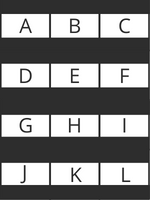
The Border Theme/ Layout
You can add white or black borders to your images to obtain this effect. You can choose either a square border or apply it only on the sides.
puzzle
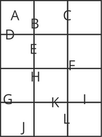
The Puzzle Theme/ Layout
All your photos are linked together and they form a bigger image.
You have to make sure that each individual photo makes sense on its own.
rainbow
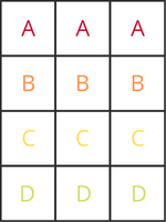
The Rainbow Theme/ Layout
This is one of the hardest themes to create because it requires a lot of work when it comes to content creation.
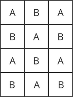
To achieve a rainbow theme you must have a minimum of 1 line with all the posts of the same color, and the following ones must change in a gradient way when you scroll down.
tiles
The Tiles Theme/ Layout
Alternate between two types of content, for example:
- Photo/Quote;
- Photo of a product/Video;
row
The Row Theme/ Layout
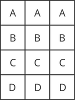
Each of the 3 lines of the grid can have a different type of content. For example:
- The first row can be a Reel, the second one can be a picture and the last one can be a video;
- The first row can be a picture, the second one a quote, and the last one another picture from the same setup.
line
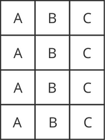
The Line Theme/ Layout
Each line of your feed contains a set of 3 posts (pictures or videos) with the same setup, or a common pattern.
Choose a specific niche
The first thing you have to decide is WHAT IS YOUR NICHE?
What will be the main topic of your Instagram account?
The less you choose, the better.
For example:
FashionBeautyTravelBusinessTechHealth & wellnessFitnessPetsGamingLifestyleInvestmentsCookingParentingPhotographyPersonal development
your niche

