RESOURCES
3. Design
DESIGNER
Robyn Williams

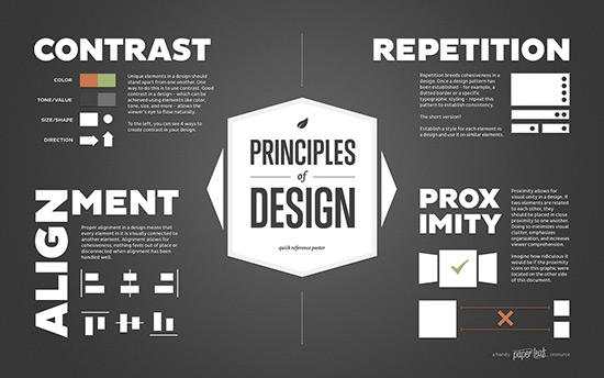
There are 4 principles for resource design:
CONTRAST
• The use of strong contrast helps to generate interest.
• The title should contrast clearly with the body text
• Contrast can be achieved with size, shape, color, position.
REPETITION
• Repeat certain design elements such as colors, symbols, words or texts to create a sense of coherence.
ALIGNMENT
• Nothing should be arbitrarily placed on the screen.
• Every element must have at least one edge connected to another element.

PROXIMITY
• Group together the items that are related. Physical closeness implies relationship When two pieces of information are related to each other.
• When two elements are not related, they can be placed far apart.
4. Bringing it all together
-Focus on the work of the teacher and experience of the learner.
-Resources involve the learner.
-The ELT is helpful.
David Nunan categorizes resources according to thetype of response required of the student:
Process
Productive work.
He identifies two main types of response:
One is repetition
The other is the practice
Interact
The main point is to consider what each resource requires from each student. This will help to know whether the resources are varied and ambitious enough.
1. Resources and their use
Ian McGrath identifies four ‘evaluative processes’
1.Selection
2. Rejection
3. Adding material
Adaptation
‘Add’ to the material by extending it
Supplementation
Introduce some fresh material to be used in addition to the original resource.

4. Changing material
The resources play a supportive role.
Teachers sometimes adopt a passive, uncritical role
Resources allow students to look at the world, while helping to shed light.
Resources in the classroom
a) Teacher
Teachers here have a dual role: they are both resources in themselves and users of resources.
b) Ready-made resources
Textbooks, educational software, gymnastic and laboratory equipment and so on.
c) Teacher-produced resources
Worksheets, assignments posted on the school intranet, PowerPoint presentations and so on.
Comparation
Ready-made resources
Advantages
Designed, edited and tested by professionals.
They are often tailored to particular courses
Their production values are often high.
Disadvantages
They’re unlikely to suit to any specific context perfectly.
The quality of resources varies and so the resources still need to be evaluated.
Teacher-made resources
Advantages
They also often cost little to produce.
They are created for use by particular classes in specific settings.
Disadvantages
Precisely because they are bespoke, they may be difficult to transfer between context.
Difficult to preserve, store and retrieve.
Poor in quality and even error-ridden.
Legibility, spelling mistakes, punctuation errors and shaky grammar.
2. Readability
There are two methods to access readability.
Quantitative measure
Calculate the average number of(a) syllables per word, (b) words per sentence and (c) syllables per sentence.
Long words tend to be harder to read than short ones
(b) long sentences tend to be harder to read than short ones.
Qualitative meassure
1.Read through the Resources text while trying to see it through the eyes of the pupils.
2. Conceptual qualities
3. Vocabulary: how reader-friendly is the choice of words?
4. Sentence construction
5. Genre conventions and discourse structure

