What is a Pyramid Chart?
A pyramid chart is one of the earliest types of charts many of us end up seeing. That is because of how it’s able to represent concepts and ideas visually. The first instance for many would come from the Food Pyramid example. This graphic organizer shows what amount of each food group we should consume to have a balanced diet.
Yet it is only one of many ways to be able to use a pyramid chart. In that example, each food choice and how much you need to eat is represented in the food pyramid. It’s an example of using a pyramid chart marker to produce a chart that shows weights based on different tiers.
Pyramid charts can also show an organization’s hierarchical structure and display research data points. In addition, creating a pyramid chart helps to convey rankings and groupings of information easily. It can also be used as a simplified organizational chart with its ranking features.
Maslow’s Hierarchy of Needs is a great example of hierarchical structures and pyramid charts. This is a chart showcasing the priorities of a human being, from its primal nature to its spiritual nature. It helps to combine functional usages of information and knowledge in a clear graphic organizer. It builds a focal point of all the data points front and center to utilize and evaluate.
How do I make a pyramid chart?
The best first step to creating a pyramid chart is using a digital chart maker to simplify it. Then understand your needs and how this chart helps you complete your mission. For example, consider if you’re going for hierarchical structure pyramid charts or for showing weighting. Then decide if you’re going to have groupings between the related tiers. Finally, you can draw outlines and have callouts if you require additional information. This helps provide information without cluttering the chart.
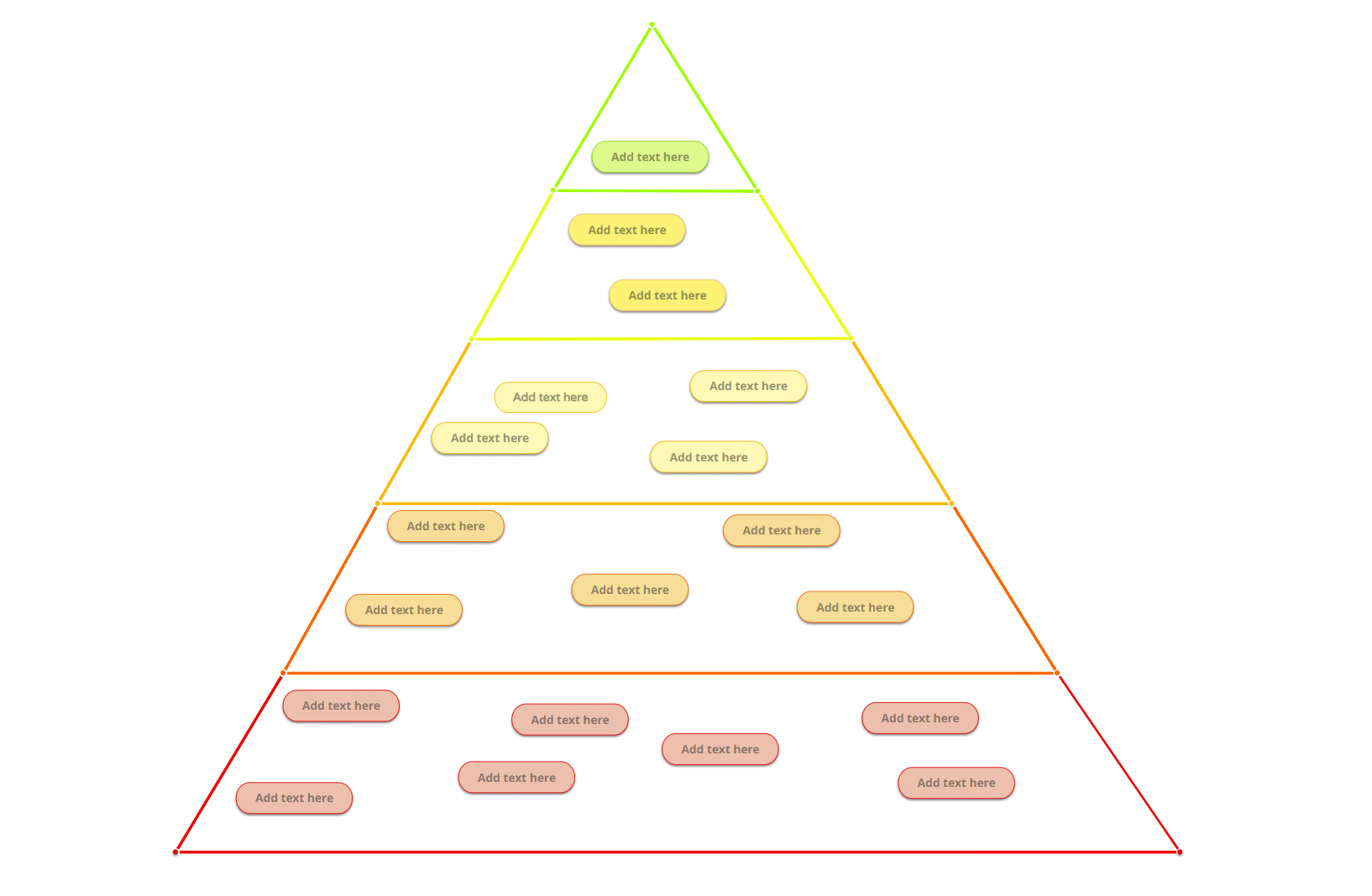
Take a look at the example below, which combines a pyramid chart and a mind map diagram. It helps to bring several categories into each tier of the pyramid as a way to organize thoughts. In addition, this chart maker subtly shifts the colors upwards, blending the elements and topics together.
Another option for pyramid charts is to use them as a straight hierarchical process separated by rich colors. For example, you can see in this pyramid chart maker how clear it is to differentiate between tiers.
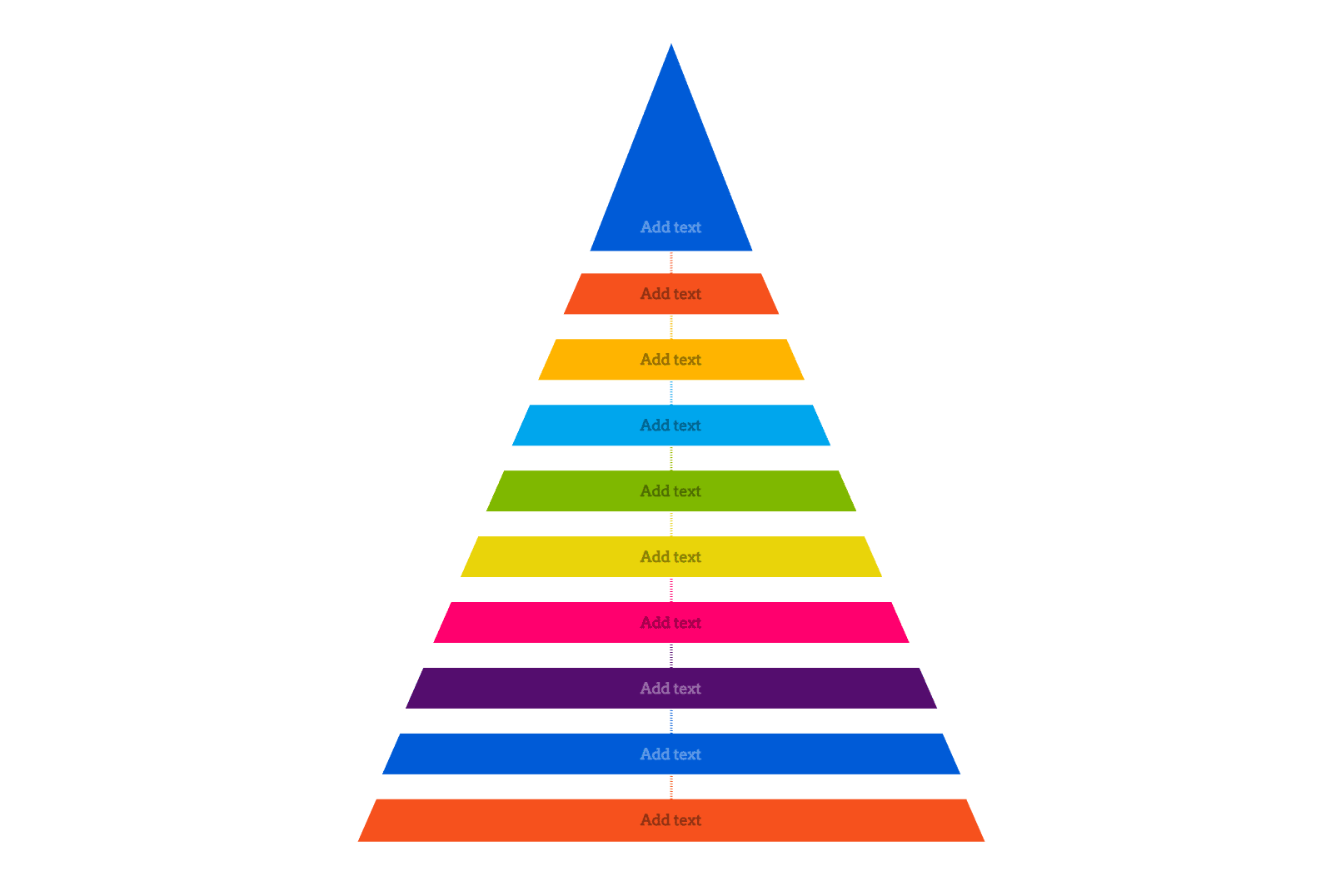
The above is a perfect option to denote rankings in an organization. The bottom level would be the lowest rank (and the largest pool of employees). The top rank would be the singular CEO of the company.
Remember not to get confused with other types of charts that look like pyramid charts. A pyramid chart is very focused in its use case and sometimes can get confused with diagrams appearing the same. A classic example is a funnel diagram or bar chart that, when constructed, could appear as a pyramid chart. These are representations of different data points. Of course, if you were looking at this kind of chart as a flowchart diagram, then that’s an excellent option, such as the example below. We start with the initial steps on the bottom and head our way to the top. Each step is another milestone to be calculated.
How do you read a hierarchy pyramid chart?
When looking at a pyramid chart that is more of a hierarchical structure, we must look at every element. The order in which we read the data needs to be sequential. The most effective is starting at the bottom, as that lays down the foundation. Then it’s about moving up each tier one by one.
The ecological chain is a great example of a hierarchical structure that showcases a pyramid chart. This is known as the food pyramid and is another classic example of creating this kind of chart. It shows all plants and animals and ranks them from primary producers (i.e., plants) all the way to Apex Predators.
Sizing
First, we look at the width and size of every single section. When creating a pyramid chart, the width denotes between sections. Therefore, the smallest portion that is on the top typically denotes the greatest level of importance.
Reading the data
When creating a pyramid chart, the information is more general when you start from the lowest tier. Then, as you go up each hierarchal level, the data gets more refined. Finally, when you hit the highest level in this hierarchical structure, the data should be as specific as it can be.
Data value
We will most likely have more data sets at the bottom of the hierarchy because we’re working with general data. That means as you move up the pyramid, the data values get less, but their importance increases. Understanding this correlation will help you make the best hierarchical pyramids possible.
Color Coding
In some cases, it is imperative to use color coding when creating a pyramid chart. This can help to keep a clear distinction between the tiers. At the same time, you can group similar tiers of the pyramid together to note they are related as well.
Always work with the right tools
You want to work with a chart maker that is more of a diagramming tool. That’s why you should always consider using Mindomo as your diagram software and pyramid chart maker. Mindomo also helps to elevate the chart maker functionality and combine your hierarchical structure pyramid with a mind map.
It’s a diagramming tool that has a minimal to zero learning curve and can be your diagram software of choice for any visuals that you need to create. The best part is that there’s always a free forever version to get the basics out of it. This includes creating a pyramid chart as well. You can collaborate and post your beautiful pyramid charts as they are created completely online.
Keep it smart, simple, and creative!
The Mindomo Team